Shiny app for interactive time-series processing
Recently, there was a need for a way to cut and manipulate some timeseries data that had been collected to quantify greenhouse gas emissions. After collection, it is necessary to manually explore the data and select parts of the time-series for further analysis. This was an obvious case for an R Shiny app that could easily be shared with others and used for interactive processing of the data. Furthermore, the short time from idea –> sketch –> prototype –> test –> deployment is just incredible. Here, I showcase the app FluxBandit, which admittedly targets a quite narrow user group but could easily be reworked for other similar tasks. The app is hosted on shinyapps.io and the app source code is also available. Check out the Github page for more info how to use the app, for example with the accompanying demo data.
Background: Measuring greenhouse gas emissions
The principles for quantifying greenhouse gas emissions are fairly simple and can be done in both aquatic and terrestrial environments. The most basic way to do it is to enclose an air volume and measure the concentration changes over time for the gas of interest (e.g. CH4, CO2, or N2O) from which the gas flux can be calculated. The chamber concentrations can be measured by withdrawing manual samples followed by analysis using gas chromatography or sensors that measure and log the signal be used. Recently, the sensor option has become more attractive due to DIY solutions that dramatically lower the cost of building these systems. However, manual post-processing of the data are often necessary though, and this is where the FluxBandit app is useful. Currently, output from both DIY and commercial (LGR, Los Gatos analyzer) sensors can be used.
Workflow: Calculating fluxes
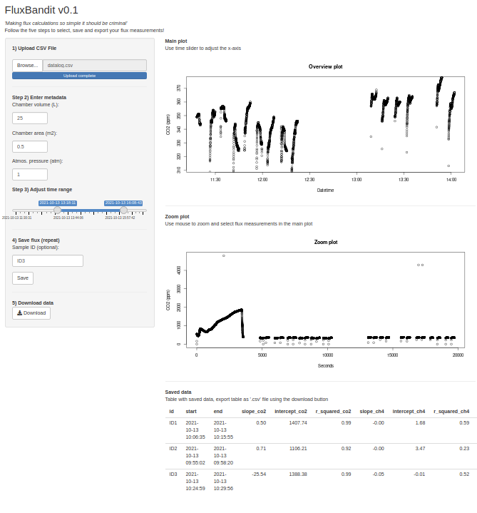
The app takes the user through all the necessary steps:
- Choose sensor type
- Import data (‘.csv’ file)
- Adjust metadata
- Define measurement:
- Select time range using slider (coarse adjustment)
- Select time range interactively in Overview plot (fine adjustment)
- Inspect selection in Zoom plot and adjust if necessary
- Save measurement (repeat steps 2-4)
- Download data the results as a ‘.csv’ file
Following these steps, the user can download flux data from all measurements along with additional statistics for use in further analysis. The strength of the app lies in its interactive nature, where the user can select data in the Overview plot using their mouse, which makes it easy to select measurements and explore the influence on the final flux calculations.
The image shows the app in action:
Concluding remarks
One of the great advantages of Shiny apps is that they can be created rapidly and relatively advanced features can easily be implemented due to the vast documentation and ecosystem around R Shiny. In this example, the app might be targeting a narrow audience and that input data has certain formatting requirements. However, this app can quickly be adapted for other use cases.